Internal Analytics Dashboard
An internal analytics dashboard built to replace AWS QuickSight for Trace's operations team — same reporting, none of the AWS login friction, and a fraction of the licensing cost.
Why it exists
QuickSight worked, but every viewer needed an AWS/federated login just to see a chart, and per-viewer licensing added up across the team. The goal was a tool that did the same reporting job with a login the whole org already knew how to use, at a fraction of the ongoing cost.
- Cost: replaces per-seat QuickSight licensing with a self-hosted stack — the ongoing cost is just server capacity already in use elsewhere.
- Login: Google OAuth instead of AWS credentials — anyone with a company email signs in the way they already sign into everything else.
- Ownership: full control over the UI and what gets built next, instead of working inside QuickSight's dashboard constraints.
Architecture
        internal users (company email)
                |
                |  Google OAuth login
                v
        Streamlit dashboard  ── auth.py validates email domain
                |
                |  REST calls
                v
        FastAPI backend
                |
                |  parameterized SQL
                v
        Data warehouse                    Secondary source
        (operational metrics)       +    (supplementary scoring data)

  containerized: Docker Compose (api + dashboard)
  process supervision: systemd, auto-restart on failure
The workflow
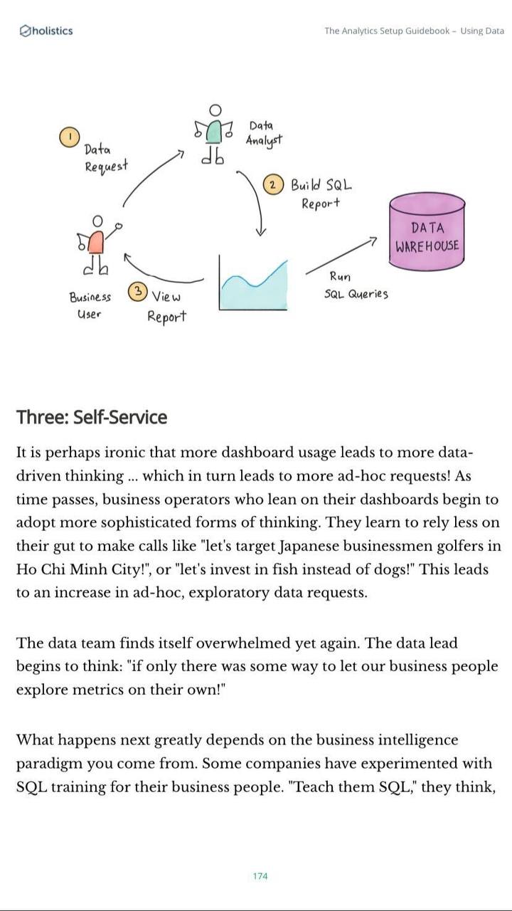
This is the role the dashboard fits into — a stakeholder asks for a metric or table they want to track over time, and I gather the requirements and build it into the dashboard, playing the data-analyst role in the diagram below. Each dashboard is set to refresh on a fixed schedule (daily or weekly, depending on the metric) and caches the result, so it isn't re-querying the warehouse on every page load — just once per refresh cycle.
Project structure
Refactored from an earlier single-file prototype into this structure — every concern (API, SQL, charts, auth, pages, config) gets its own file and directory rather than one growing script.
analytics-dashboard/
├── .gitignore                      # Files excluded from git
├── .gitattributes                  # Git path attributes
├── docker-compose.yml              # Multi-container orchestration (api + dashboard)
├── Dockerfile                      # Root image build
├── execute.sh                      # Dev-mode execution script
│
├── api/                            # FastAPI backend
│   ├── .streamlit/                 # Streamlit config scoped to the API service
│   ├── sql/                        # Query bank — SQL kept out of Python entirely
│   │   ├── __init__.py         # Utility: reads .sql files into query strings
│   │   ├── query_1.sql         # Metric query, domain 1
│   │   ├── query_2.sql         # Metric query, domain 2
│   │   ├── query_3.sql         # Metric query, domain 3
│   │   └── query_4.sql         # Metric query, domain 4
│   ├── Dockerfile                  # API container image
│   ├── main.py                     # Endpoints, warehouse connection, CORS, health checks
│   └── requirements.txt            # API dependencies
│
└── dashboard/                      # Streamlit frontend
    ├── .streamlit/
    │   └── secrets.toml            # OAuth + service-account credentials (gitignored)
    ├── assets/
    │   ├── logo.png                # Brand logo
    │   └── favicon.png             # Browser tab icon
    ├── charts/                     # One module per chart domain
    │   ├── __init__.py
    │   ├── dashboard_chart_1.py    # Visualizations, domain 1
    │   ├── dashboard_chart_2.py    # Visualizations, domain 2
    │   ├── dashboard_chart_3.py    # Visualizations, domain 3
    │   └── dashboard_chart_4.py    # Visualizations, domain 4
    ├── components/
    │   ├── __init__.py
    │   └── auth.py                 # Google OAuth flow + email-domain validation
    ├── pages/                      # One file per dashboard, Streamlit auto-routes by filename
    │   ├── __init__.py
    │   ├── Dashboard1.py
    │   ├── Dashboard2.py
    │   ├── Dashboard3.py
    │   └── Dashboard4.py
    ├── utils/
    │   ├── __init__.py
    │   ├── config.py               # Environment detection: Docker vs. local
    │   └── session.py              # Session state + auth persistence across pages
    ├── .env                        # Local dev environment variables (gitignored)
    ├── Dockerfile                  # Dashboard container image
    ├── Home.py                     # Entry point — work sample landing page + auth gate
    ├── requirements.txt
    └── requirements_backup.txt
The stack
Auth & access
Every dashboard sits behind Google OAuth, scoped to verified company email addresses only — no shared logins, no separate password to manage, and access revokes itself the moment someone leaves the Google Workspace org. Session state persists across pages so a login isn't needed per dashboard.
- Unauthenticated visits to
Home.pyshow a Google login button; no dashboard content renders until the OAuth flow completes. auth.pyvalidates the returned email against the company domain before a session is created — an outside Google account cannot get in.- Session state is managed in
utils/session.pyso navigating between pages doesn't re-trigger login.
What it reports on
- Dashboard 1: A scoring/quality metric pulled from a secondary source via a service account. Cached 24 hours, updates on manual refresh.
- Dashboard 2: Operational reliability patterns, queried live from the warehouse through the FastAPI backend.
- Dashboard 3: Volume and trend analysis across categories and time periods, also backend-fed from the warehouse.
- Dashboard 4: Real-time status and telemetry across a deployed fleet, last 24 hours.
Data flow, by dashboard
- Dashboard reads directly from a secondary source using a service-account credential
- dashboard_chart_1.py builds the Plotly visualizations from that data
- Result is cached for 24 hours to avoid re-fetching on every page load
- A manual refresh re-pulls and updates in real time
- Dashboard page calls the FastAPI backend over REST
- FastAPI loads the matching query from sql/ (one .sql file per metric domain)
- API executes the query against the warehouse and returns JSON
- The page's matching chart module renders the response
Refactor notes
Recently rebuilt from a single-file version into the modular structure above. What changed and why:
- Modular chart organization: Visualization code split into one module per metric domain — cut page-script complexity and made charts reusable across pages.
- Centralized configuration: utils/config.py auto-detects Docker vs. local environment and resolves the API URL accordingly — no hardcoded environment branching in page code.
- Separation of concerns: Pages own layout and user interaction only; chart modules own visualization logic; utils own shared state — each file has exactly one job.
Deployment
Runs as two Docker containers (API + dashboard) via Docker Compose, fronted by a reverse tunnel for remote access and supervised by a systemd service so both containers restart automatically on failure or after a host reboot — no manual intervention to bring it back up.
What I owned
- Designed and built the FastAPI backend, including all warehouse queries and API endpoints.
- Implemented Google OAuth with email-domain-restricted access and persistent session handling.
- Built all Streamlit dashboards and their Plotly visualizations.
- Refactored the codebase from a single-file prototype into the modular structure documented above.
- Containerized the app and set up systemd-supervised deployment with automatic restarts.